Face Value:
Façades and First Impressions
Façades and First Impressions
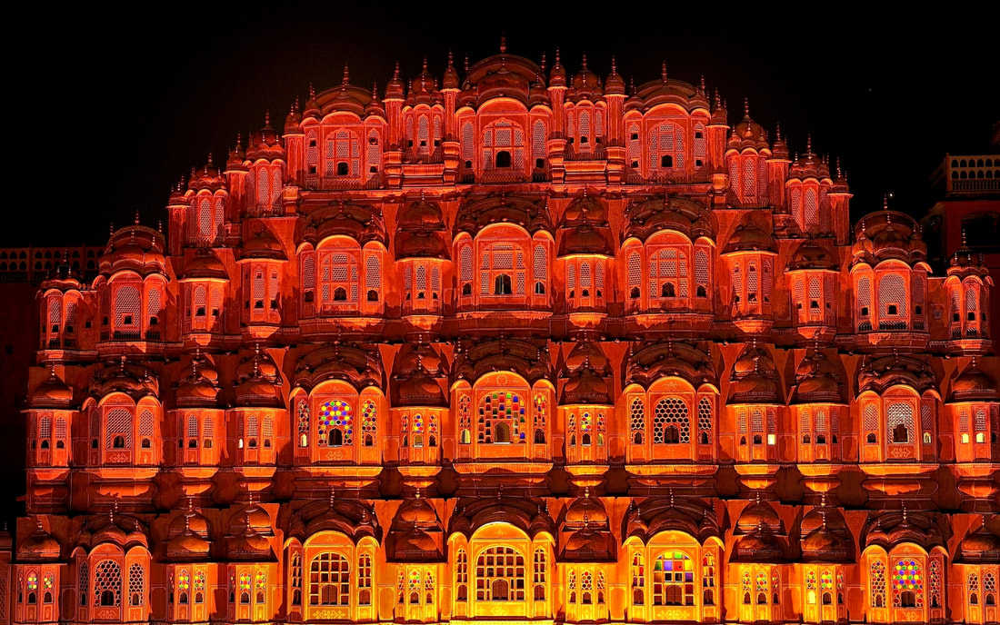
Hawa Mahal ("Palace of Winds") in Jaipur, India. The structure was designed and built with local red and pink sandstone in 1799 by Lal Chand Ustad for Maharaja Sawai Pratap Singh. The original intent of the design was to allow royal ladies to observe everyday life and festivals celebrated in the street below without being seen. This design also allowed cool air from the Venturi effect to pass through, thus making the whole area more pleasant during the high temperatures in summer.
Once a culture has progressed beyond simple survival and shelter from the elements, there is a language and vocabulary of architecture which is intended to communicate with people when they approach a structure. Look at the front façade of the building.
The basic geometric shapes we are studying this year--cubes, pyramids, cylinders, prisms, cones, and spheres--and parts, variations, and combinations of them comprise the forms architects use to form most structures. With the exception of some highly experimental structures, most buildings designed by architects will make use of these basic building blocks. The arrangement of these basic forms still provide a great deal of variety of design.
The outline of the shapes and planes that make up a structure form edges with the space around it and create a visual impact. On the facade, the elements of windows and doors and the materials used will also create patterns of edges as one material or element transitions to another.
Architects may use a series of similar forms to create repetition and visual rhythm to create a sense of order for the owner of the home, visitors, or those passing by the home.
Shapes, Patterns, and Groupings: Balance
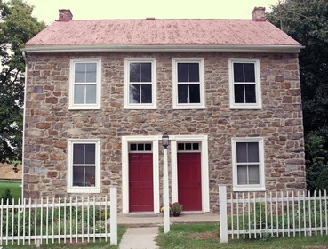
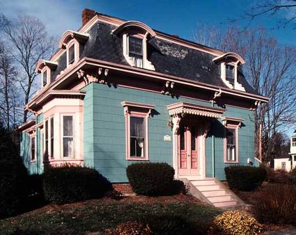
Symmetry When the forms used and planned repetition of elements and lines have a one-to-one correlation on the left and right sides, the structure exhibits symmetry. This formally balanced quality was a goal during different eras.
Eras placing emphasis on or valuing symmetry include: Georgian, Federal, Greek Revival, Second Empire, Colonial Revival, Art Deco, and Internationale/Modern. Colonial era homes will often present symmetry along the front face, but may have been added to over time to appear asymmetrical when viewed from other sides. |
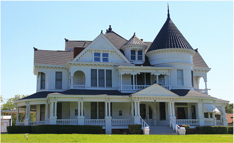
AsymmetryMultiple forms, even if each is very different, may still be arranged into a single related structure that is pleasing to the eye. Architects that work with a variety of forms use visual balance rather than repetition--several smaller elements arranged in one part of the structure balance a larger form included on another part of the building. If the asymmetry looks haphazard or imbalanced, it can leave viewers with an unsettled or chaotic impression.
Eras that use asymmetry as a deliberate design motif include Gothic Revival, Queen Anne, Stick Style, and Postmodern. Romanesque Revival will often give this impression, as will Colonial-era houses added to over time when looked at from different sides. |
Simplicity and Complexity of Forms
|
|
The exterior walls and forms of a building give an immediate impression of simplicity or complexity. The edge lines, texture of the surfaces, variations in elements, colors, and ornamentation are all considerations in assessing the visual impact.
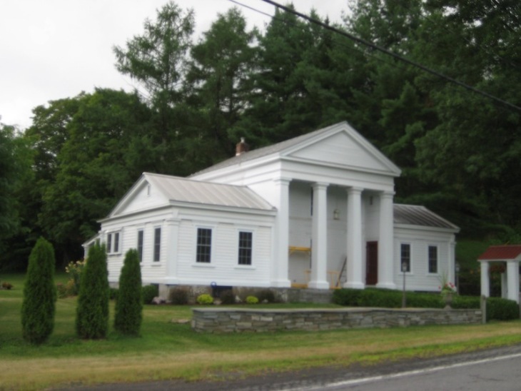
Simplicity Simple forms presented with little ornamentation may risk provoking the criticism that the design is "cold," impersonal, or "boring." The same structure can also evoke positive associations of being solid, reliable, and "classic."
Eras using simplicity of form as a deliberate design motif include Georgian, Federal, Greek Revival, and Internationale/Modern. |
Ornate An ornate or visually-complex structure may give an initial impression of energy and excitement. Personal reactions vary, however, and some may criticize an ornate facade as "busy," lacking in unity or harmony.
Eras using ornamentation in their visual presentation include Italianate, Gothic Revival, Second Empire, and Queen Anne. |
Color and Texture
|
|
Color is a sensory perception, and as any sensory perception, it creates immediate associations with memory and emotion. Design considerations in a man-made environment include how the reception of visual stimulation from a structure produces the best response in visitors and passers-by. Varied environments with different functions, such as medical and psychiatric facilities, offices, industrial and production plants, educational facilities, homes for the elderly, or correctional facilities, will have a different range or palette of colors.
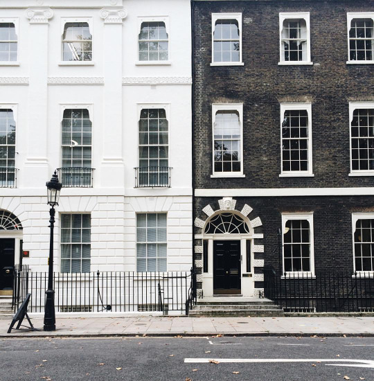
MonochromaticGreek Revival, Romanesque, Internationale/Modern.
Black is strong, classic, mysterious and powerful. The most sophisticated shade of the spectrum, people associate it with style, elegance, and expensive taste. White is an open, vast, neutral color of possibilities. The message communicated to observers or visitors may be purity, sterility, cleanliness, and calmness. Cautions: Monochromatic color schemes may result in understimulation for residents, workers, or visitors, perceived as boredom, lack of energy, or a desire for novelty or change. 
Kiev, Ukraine, before and after post-Communist makeover in 1990s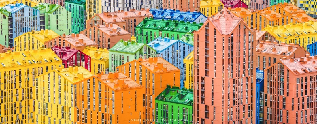
|
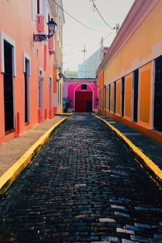
PolychromaticVictorian, Art Deco, Postmodern/Contemporary.
To mention a few examples concerning colors and what they may convey: Yellow is perceived as cheerful and energetic, yet mellow and soft. Just like the mid summer sunshine, it portrays hope, happy times and used as a way to grab one's attention. In nature yellow can be seen on bees, fish, sunflowers, and of course, the sun. Orange is a friendly, vital, inviting, energetic and playful color. Orange is perhaps the hottest of all colors, which is why almost everyone can relate to it in some way or another, especially children. Other naturally occurring orange colors are goldfish, flowers and tangerines. Red excites, stimulates and creates arousal. People often think of the color as daring, warm, dynamic, bold and sexy. Red is an aggressive color, whereas it commands attention and demands action. Other everyday examples are red sports cars, red dresses, and stop signs. Green is the color of nature, and everything that goes with it. It has been described as refreshing, healing, soothing and prestigious (when associated with money and banks). Other examples of soothing green can be found everywhere in nature, from vegetables to meadows and forests. Blue is a very stable and dependable color. As with the ocean and sky that are always constant, blue inspires confidence, commitment and a sense of serenity and peace. Many financial institutions, mortgage brokers and large corporations that are conservative in nature, tend to use blue. Water bottling companies also use blue to portray freshness. Purple reflects elegance, sensuality, spirituality and creativity. Purple is perhaps the most complicated and rare color, hence referred to as a majestic and royal, fit for kings. Most businesses are hesitant to use purple because of its sensual properties--many visitors or inhabitants of structures decorated in purple will have strong reactions, positive or negative, unless the purple is minimized. Brown is the ultimate traditional earth color, associated with substance, durability and security. It's earthly tones lend perfectly to food and food related items, even used in restaurants and coffee houses. Cautions:
Overstimulation with color can result in changes in the rate of breathing, increase of pulse rate and blood pressure; increase in muscle tension; or psychiatric stress reactions of varying types. The basic signs of an overstimulated environment is strong color intensity (highly saturated), color harmonies that are too complex or incongruous, contrasts that present themselves too strong, or too many complex visual color patterns. |
