Telling Stories with Data and Graphs
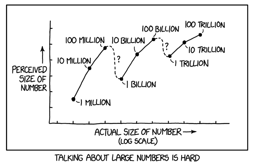
https://xkcd.com/2091/
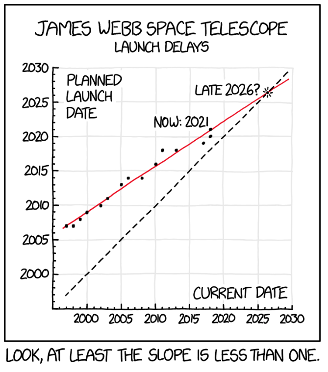
Randall Munroe
Randall Munroe
Graphing Weather Data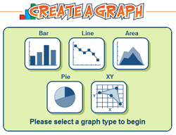
Let's use the data we collected for NASA to understand patterns of temperature, time, and cloud cover. Remember to e-mail your teacher and yourself the graph when you finish! https://nces.ed.gov/nceskids/createagraph/
How To Create-a-Graph: Video ExampleMore than Numbers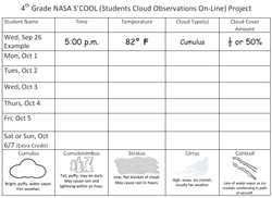
The data you collected for two weeks about the clouds, cloud cover, and temperature tells a story if you share it the right way. If you leave it in a table (rows and columns), like the one we used to record the data, it is hard to see the story. However, if you use the numbers and notes to draw a picture with certain rules and guidelines, patterns come out and help people looking at it create new ideas and connections. That is why scientists use graphs--they tell a story with numbers in a visual way.
Line Graph: Patterns Over Time
Time. It’s on your computer, your watch, your family's phones, and just about anywhere else you look. Even without a clock, on weekends or out camping, you feel time as you wake up and go to sleep and the sun rises and sets. So it’s only natural to have data over time. It lets you see how things change.
The most common thing you look for in time data is trends. Is something increasing or decreasing? Are there seasonal cycles? To find these patterns, most people have to look beyond lists of numbers to get the whole picture. For example, the temperature on one day doesn't tell us much, but when we look at what came before and after, we gain a better understanding of what story the numbers tell us. 
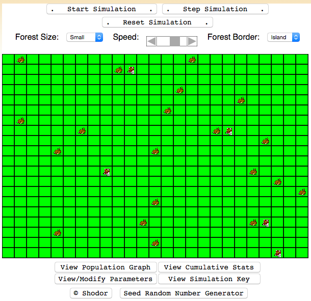
Rabbits vs Wolves Ecosystem Cycles |
Thanks, Mr. Playfair!
William Playfair of Scotland lived in the 18th century (the 1700's, the century that ended in 1800) and into the 19th century. He wanted to show people how money was being spent by businesses, so he used lines that showed direction over time (Line Graphs), lines that compared different categories side-by-side (Bar Graphs), and circles that showed parts of a whole cut up like slices of a pie (Pie Charts). He was the first person known to share information this way.
When he placed his charts in books and newspapers, many other people began sharing their information the same way. They can be very useful tools. Thanks, Mr. Playfair! With a name like that, you know he had to be a good guy! Bar Graphs: Comparing Different Categories or Sets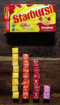
There are two kinds of people in this world--people who put things in categories, and people who don't.
Scientists find it useful to compare how often different objects or events occur during observations. For example, we can compare how many of each flavor Starburst appear in a single package. During an election year, we will often see bar charts comparing people's opinions of who would make a good president. In weather, we can compare how often different categories of cloud (cumulus, cirrus, stratus, and cumulonimbus) were observed in our two week observation. 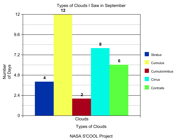
Pie Charts: Parts of a Whole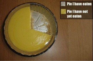
. . . and now I won't eat my lunch because I spoiled my appetite.
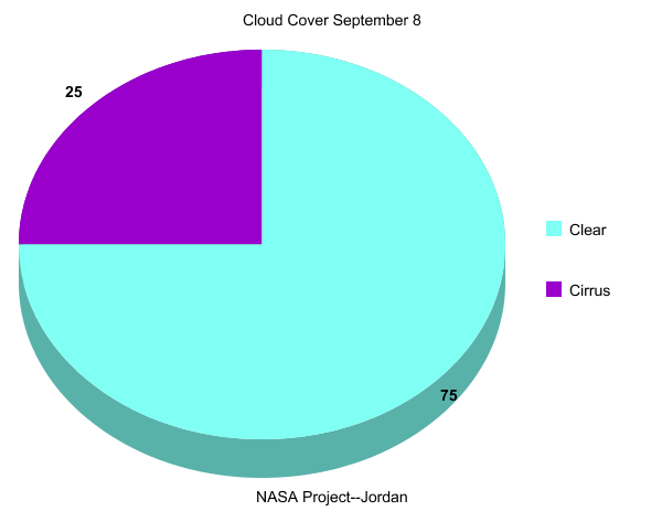
We start with a circle, which represents a whole set, such as the total area of the sky we can see, or the total number of days we watched the sky. Then we cut wedges, like you would a pie. Each wedge represents a part of the whole. Remember that last part, because a lot of beginners make this mistake. The percentage of all the wedges should add up to 100 percent. If the sum is anything else, something is missing, or you might have reversed a number (23 instead of 32).
Creating Pie Charts |


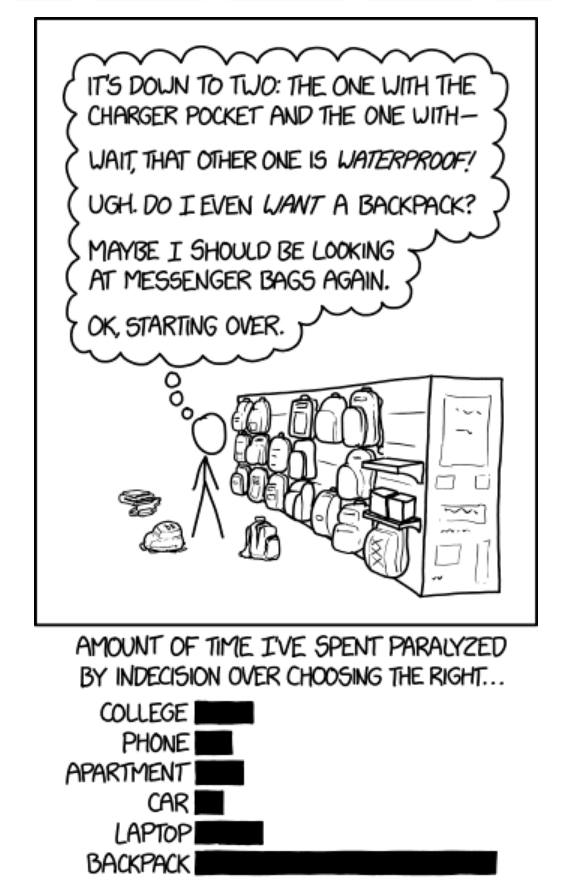
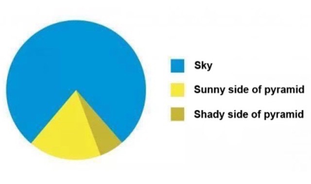
xkcd comic by Randall Munroe
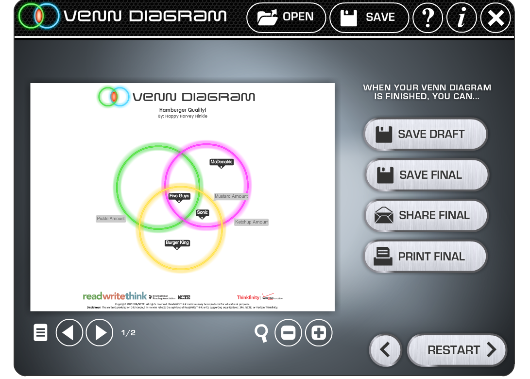
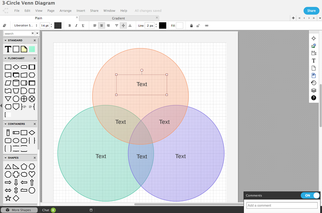
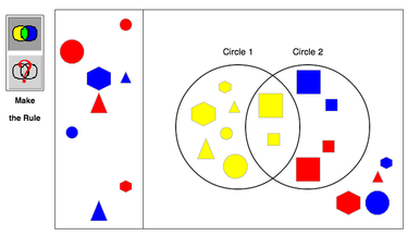
Venn Diagrams

The World Reduced to Infographics, by Patrick Casey and Dr. Worm Miller, 2011
Read-Write-Think
|
LucidChart
|
|
|
Interactivate: Venn Diagrams
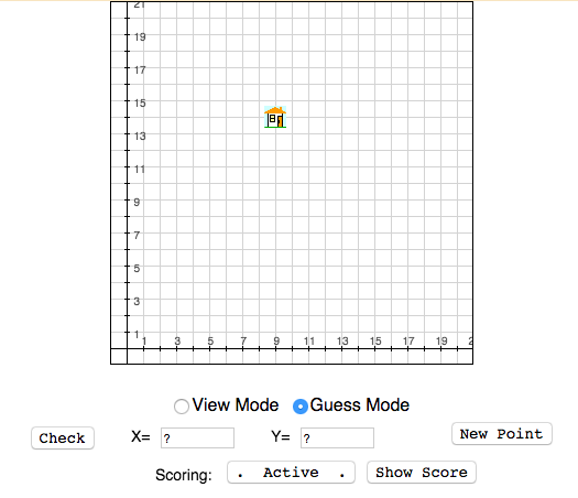
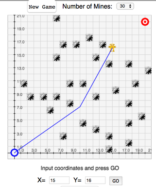
Cartesian Coordinates
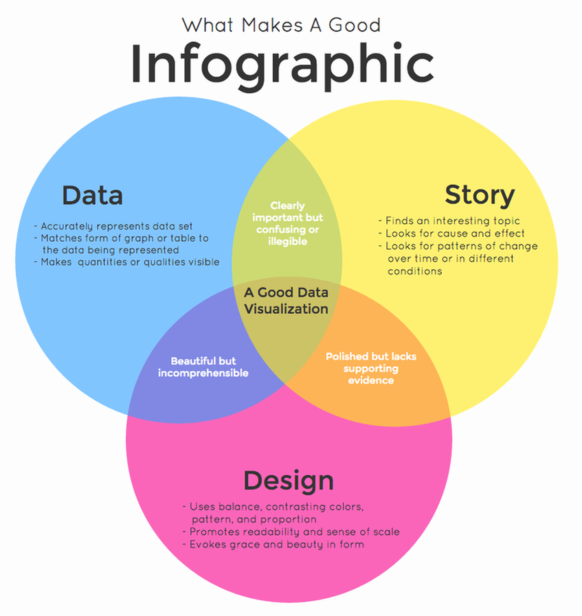
The Power of Infographics
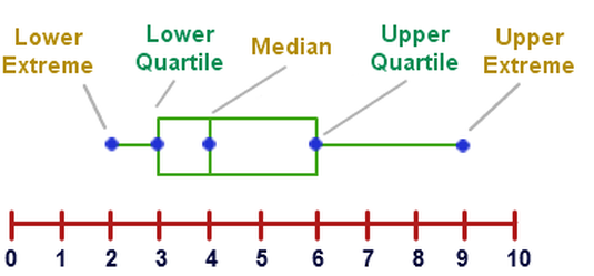
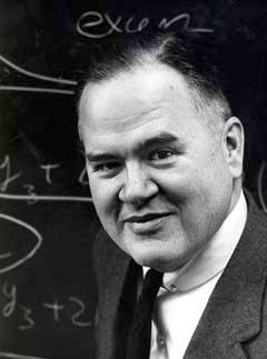
The greatest value of a picture is when it forces us to notice what we never expected to see. This is my favorite part about analytics: Taking boring flat data and bringing it to life through visualization. Numerical quantities focus on expected values, graphical summaries on unexpected values.--John Tukey, American mathematician and inventor of the box-and-whisker plot.
|
|
Jill Pelto's watercolors use line charts to illustrate climate change dataI am an Artist and a Scientist; I am a Masters of Science student at the University of Maine and have also completed degrees there in Studio Art and Earth Science. I have always loved the outdoors and want to use my creative skills to communicate information about extreme environmental issues with a broad audience. I see nature as a work of art, and the origin of my observational skills. http://www.jillpelto.com/#intro |

|
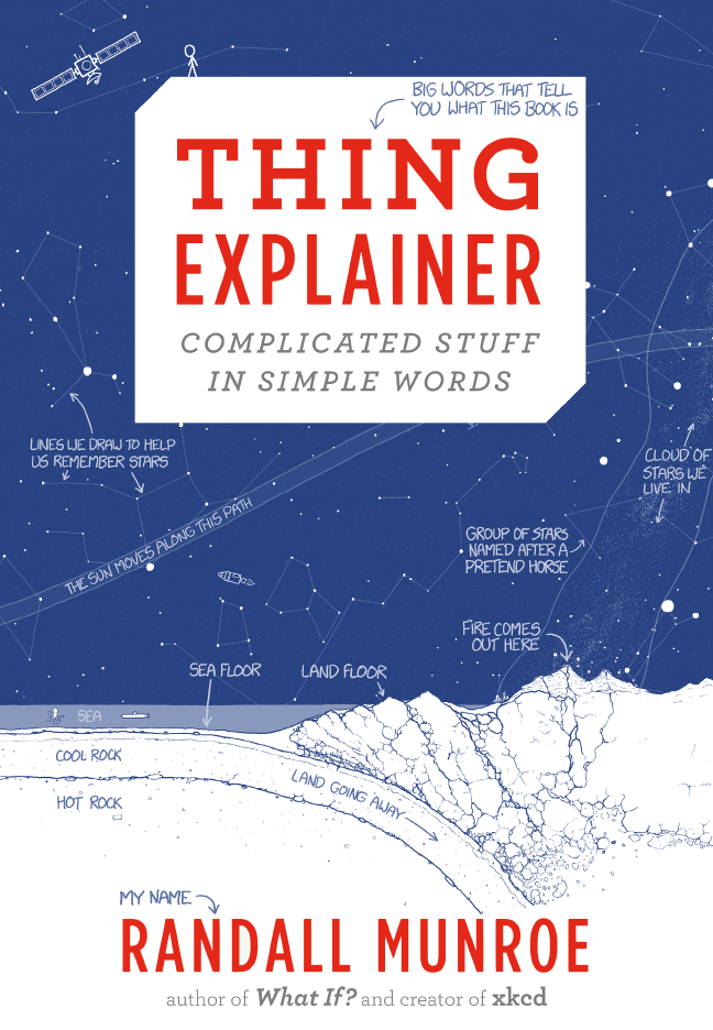
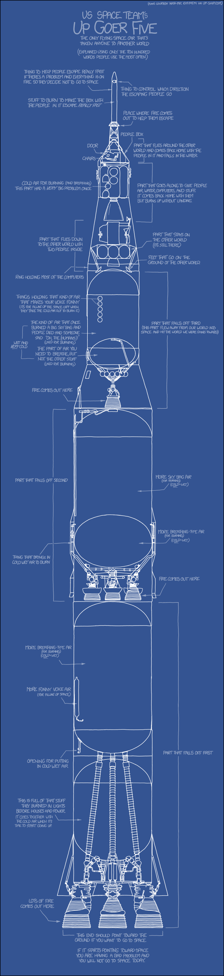
In Thing Explainer: Complicated Stuff in Simple Words, objects and events are explained using only drawings and a vocabulary of the 1,000 (or "ten hundred") most common words. Explore computer buildings (datacenters), the flat rocks we live on (tectonic plates), the things you use to steer a plane (airliner cockpit controls), and the little bags of water you're made of (cells).
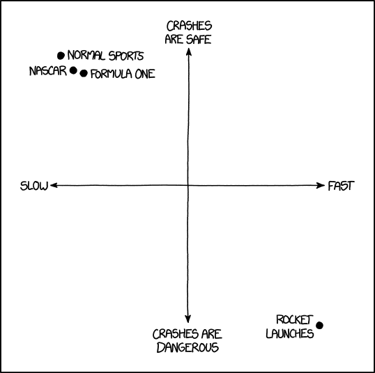
Speed and Danger--Two-Axis Diagram
by Randall Munroe NASCAR removed the passenger seats because drivers hated how astronauts kept riding along with them and loudly announcing "Ahh, what a nice and relaxing drive." A two-axis diagram with x-axis representing speed and y-axis representing safety. There are four plots in the diagram, three close together in the top left corner and one in the bottom right corner. Each plot is labeled with a high-speed form of transportation. |
|
David McCandless, 2009, http://www.informationisbeautiful.net/
