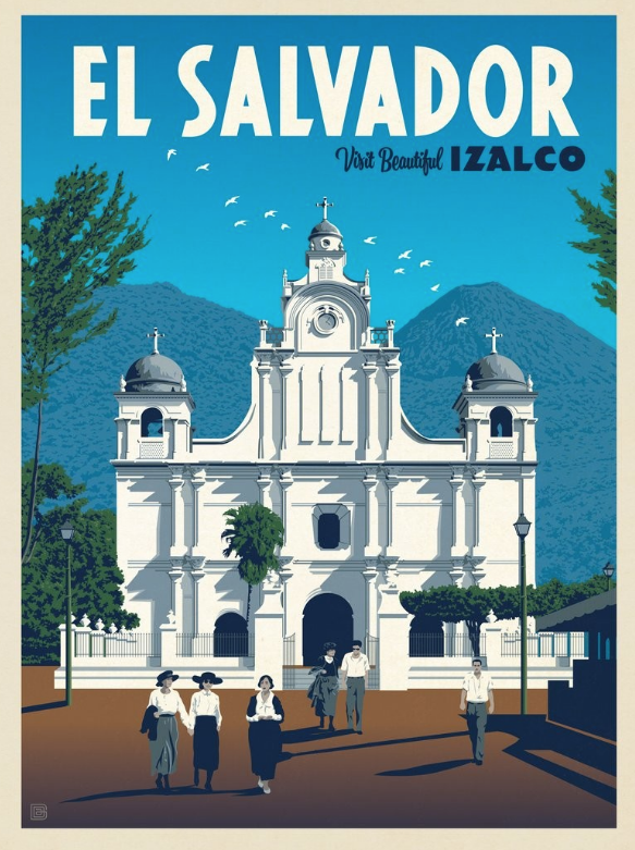
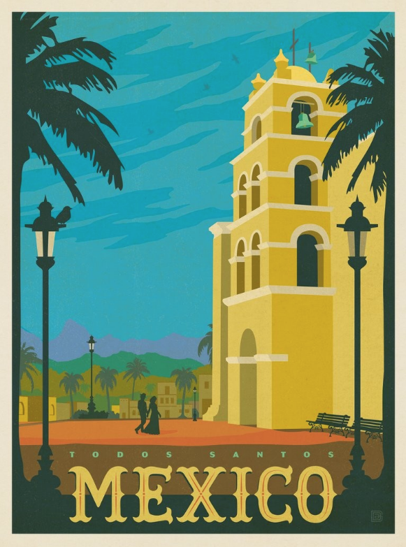
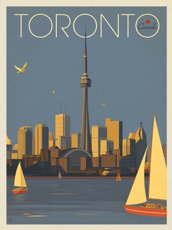
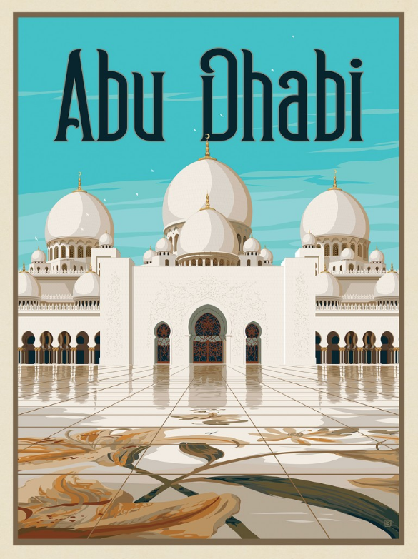
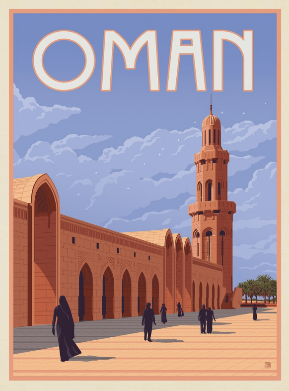
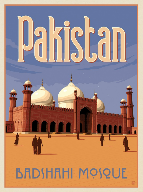
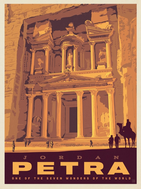
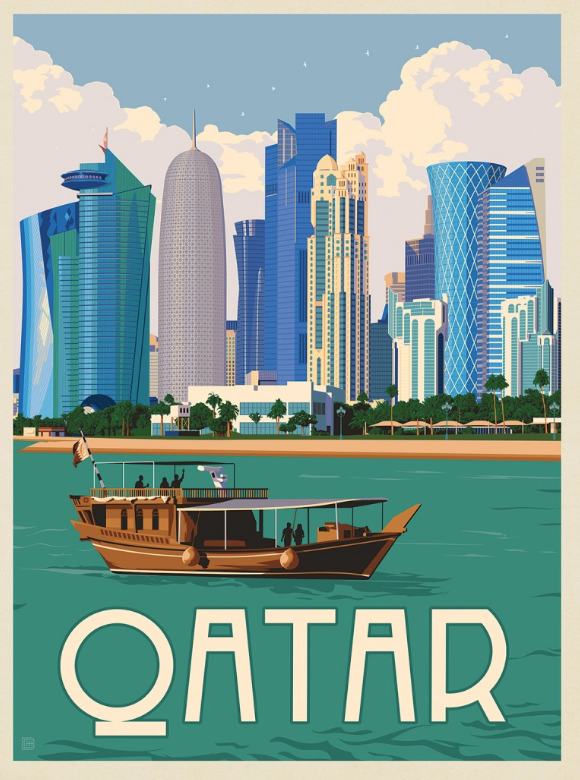
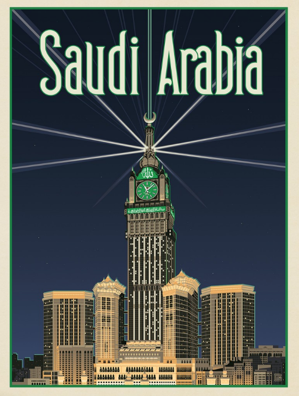
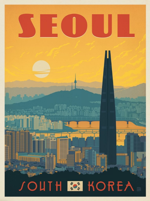
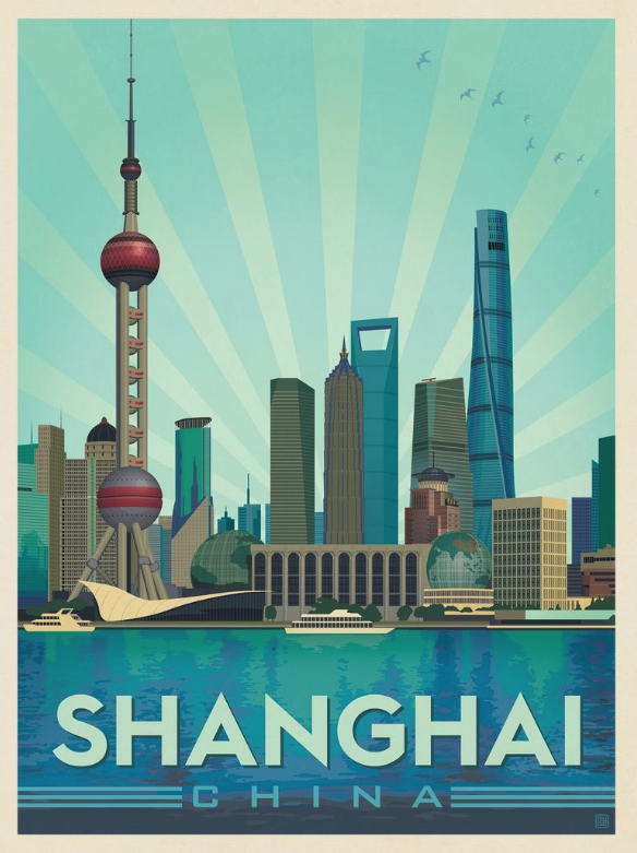
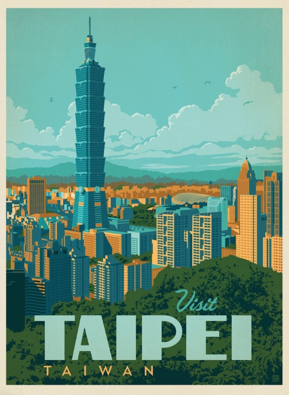
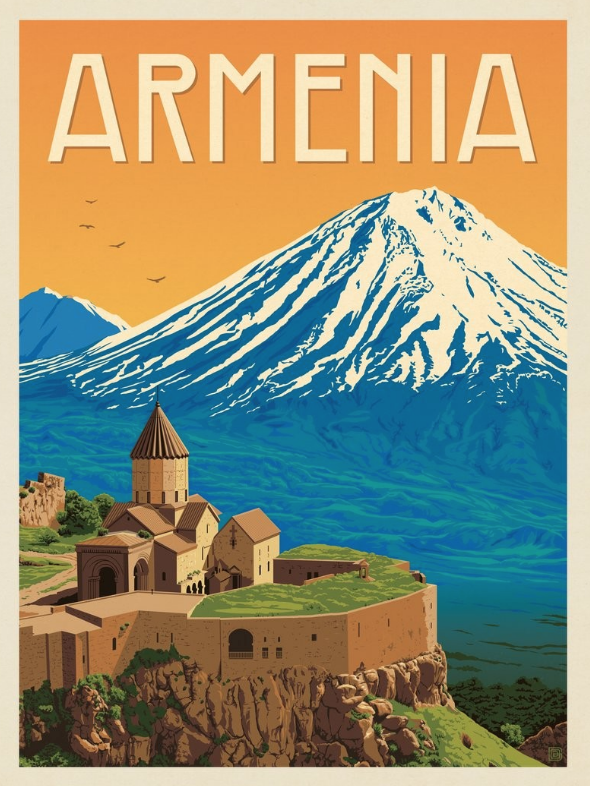
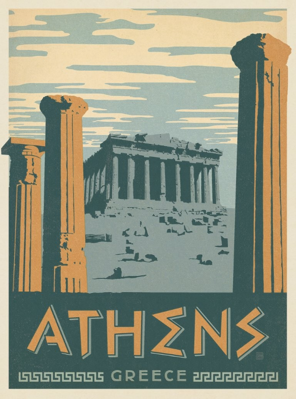
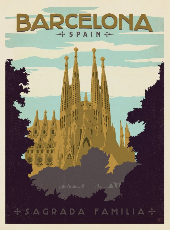
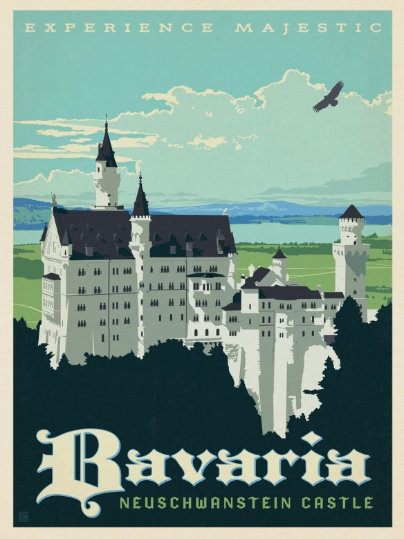
Sketchbook Inspiration:
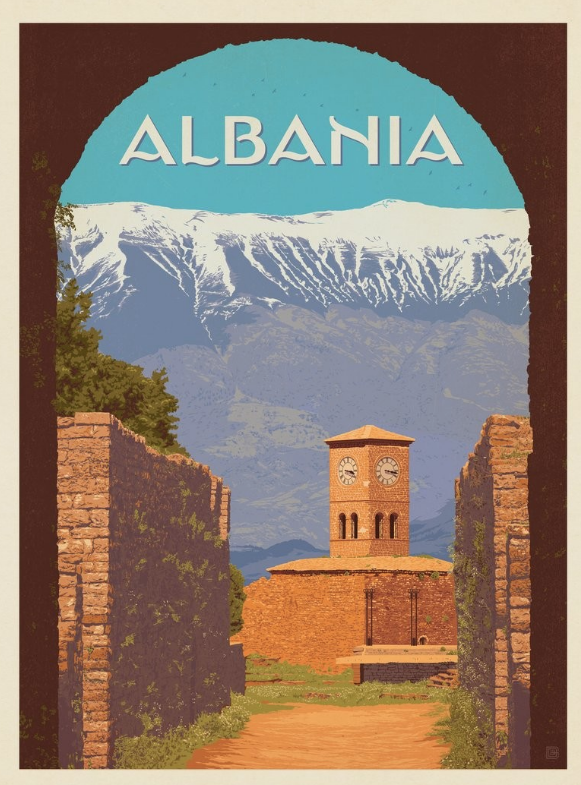
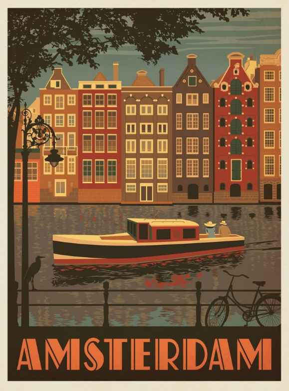
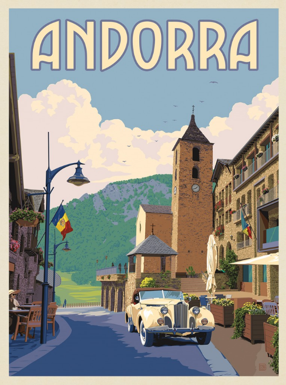
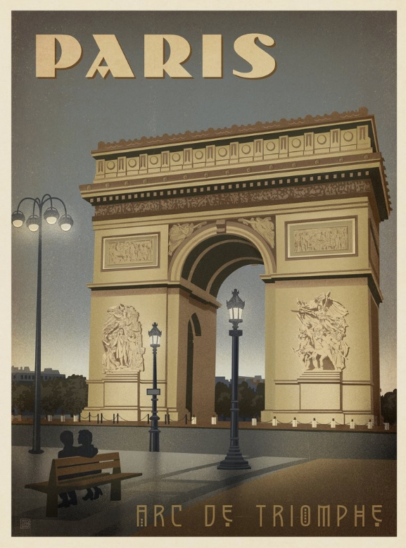
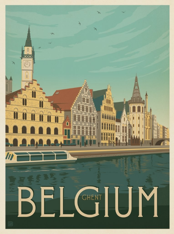
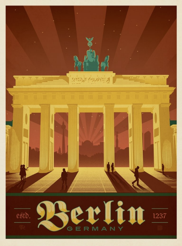
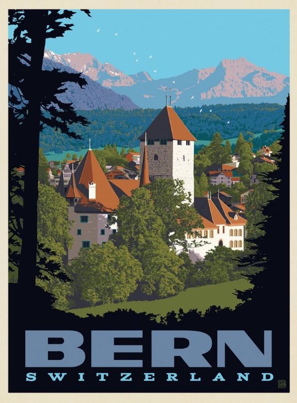
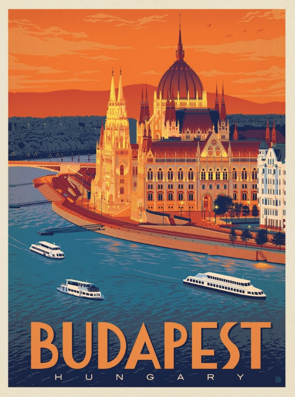
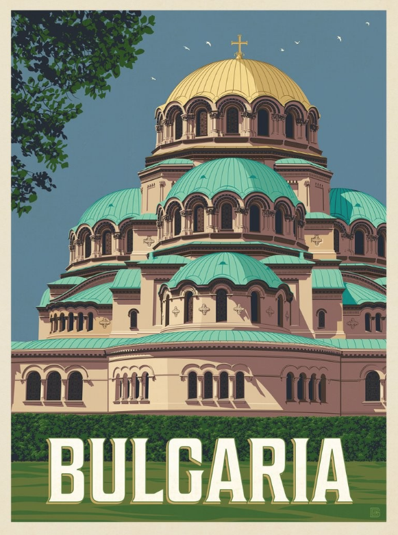
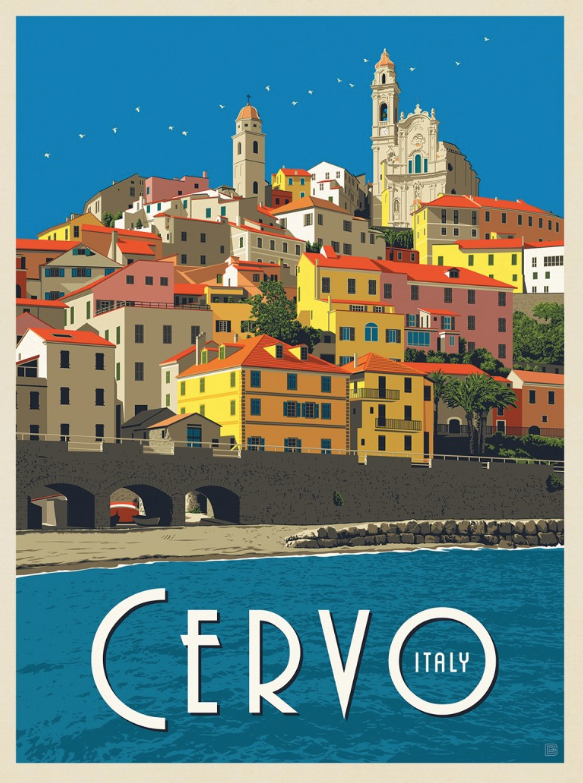
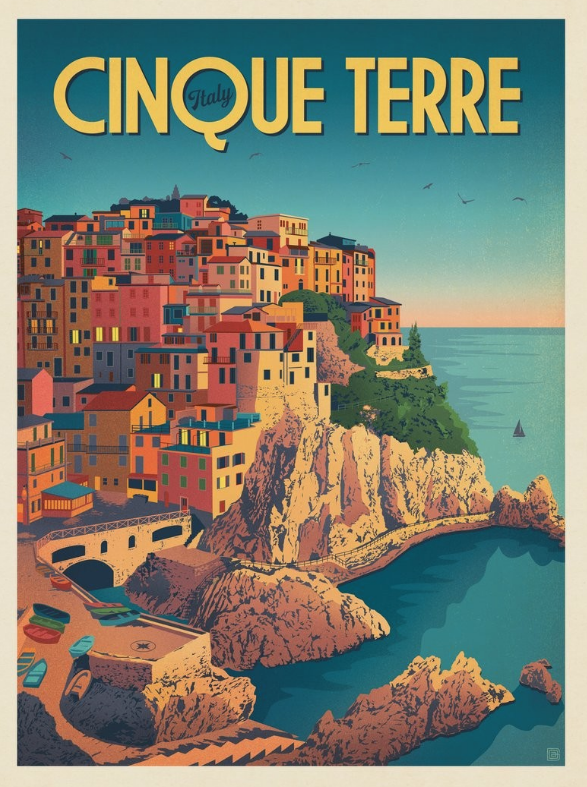
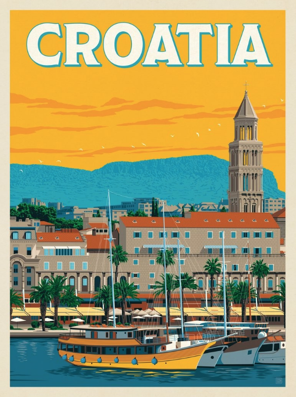
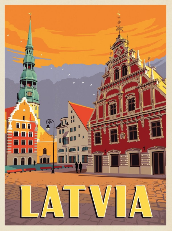
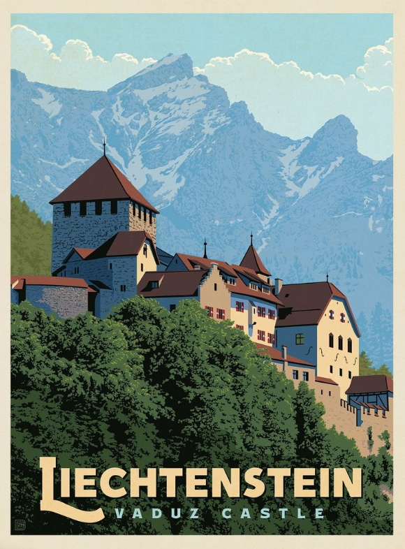
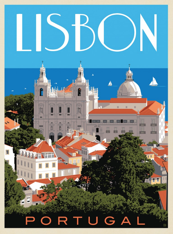
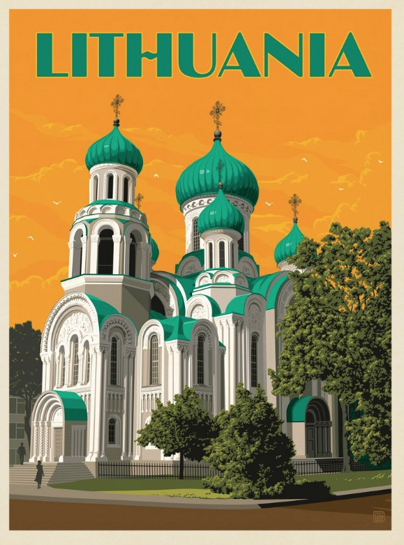
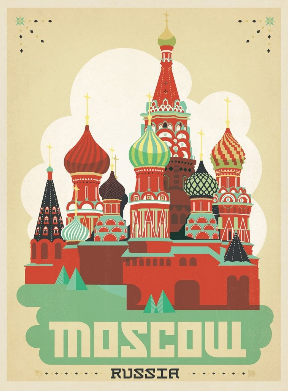
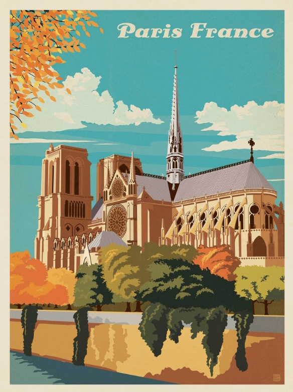
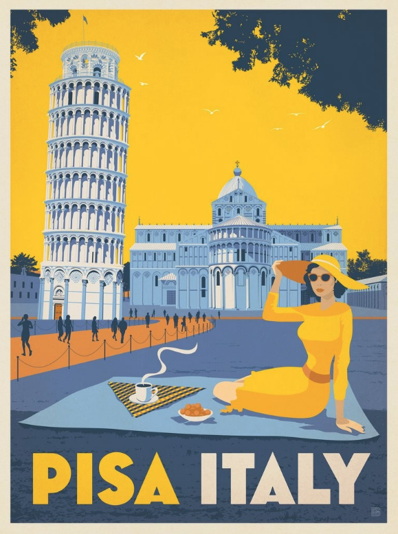
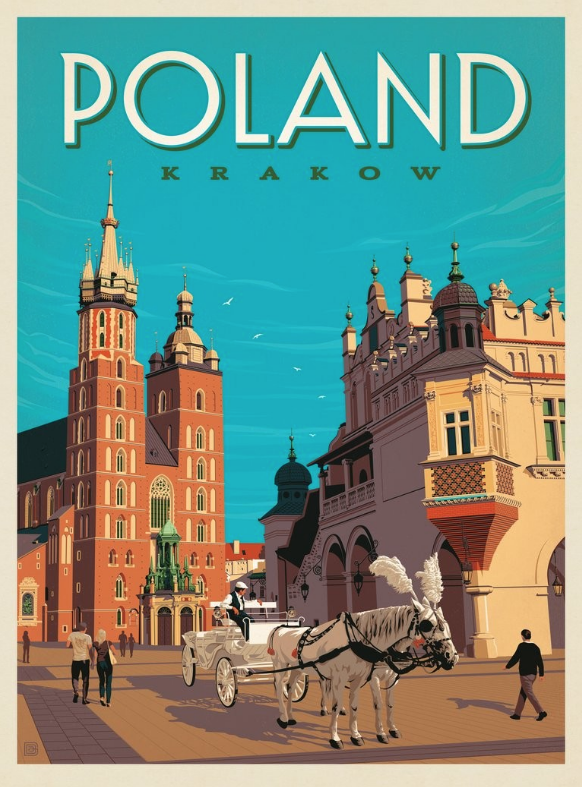
World Travel Architecture Posters
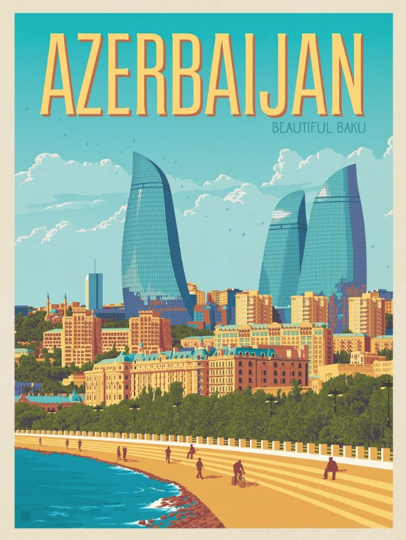
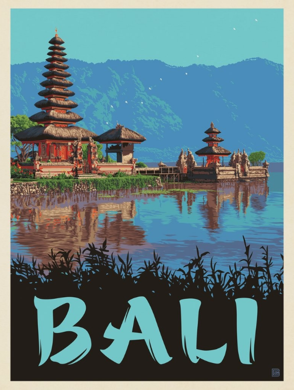
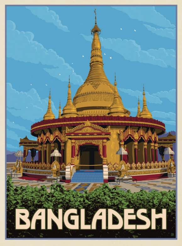
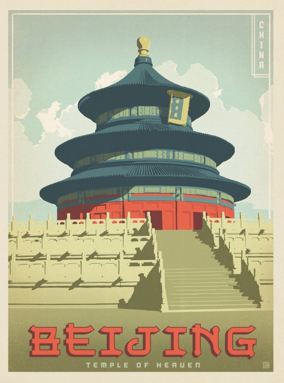
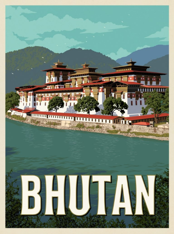
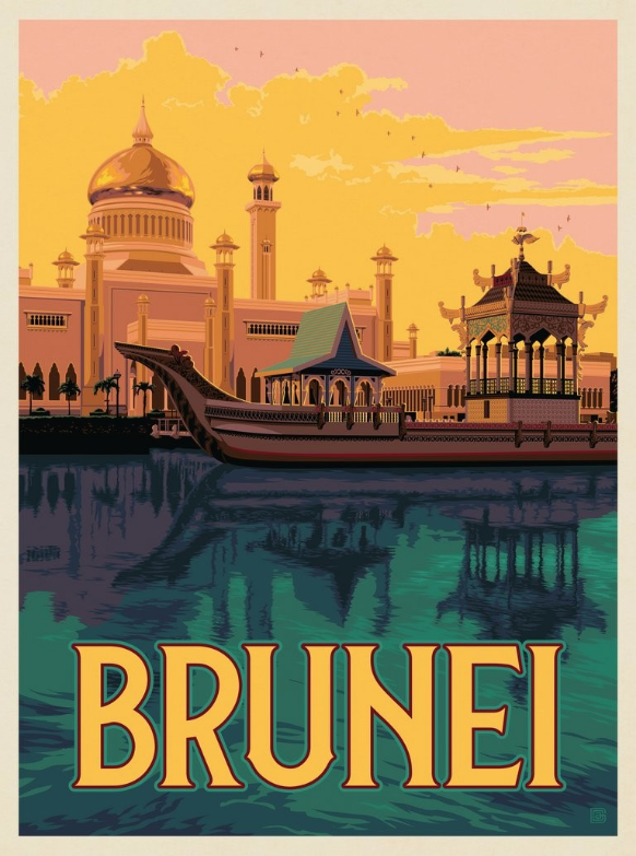
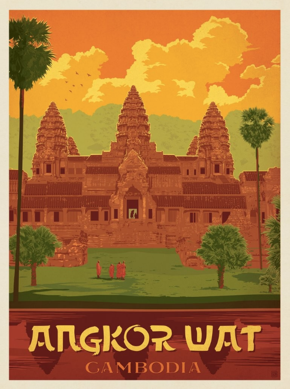
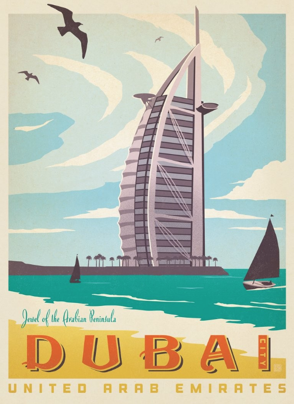
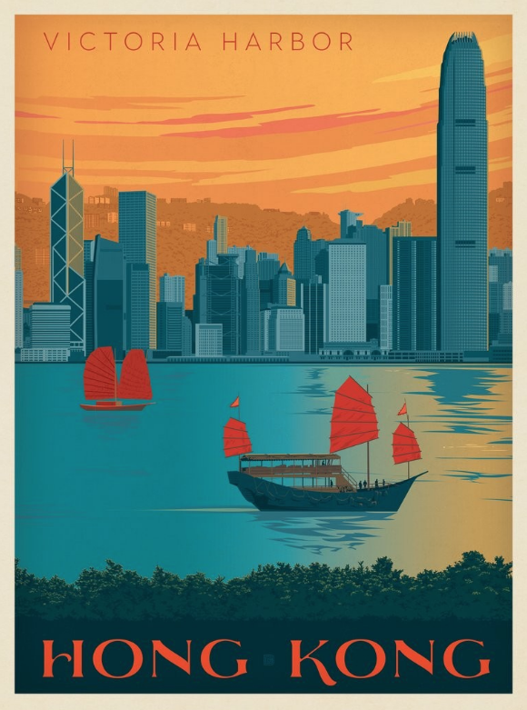
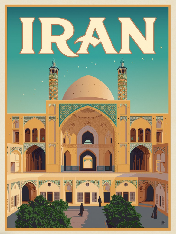
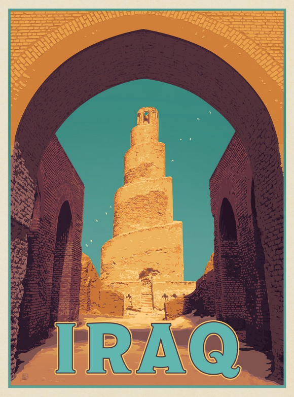
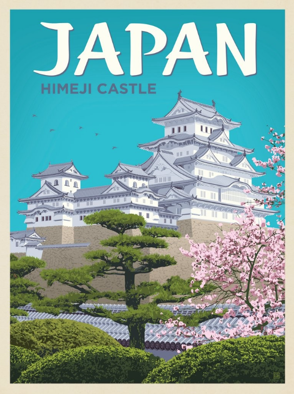
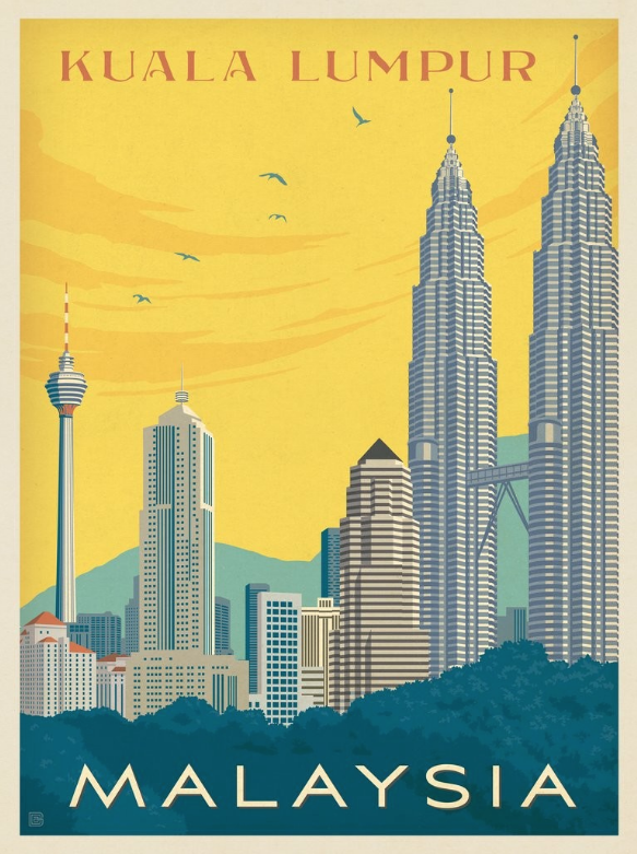
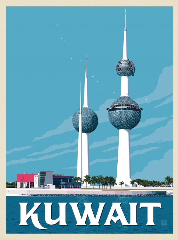
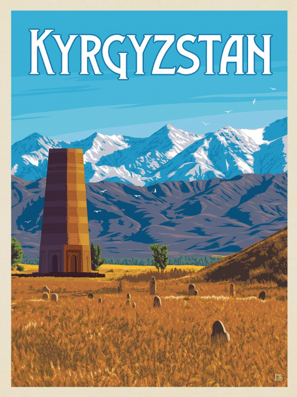
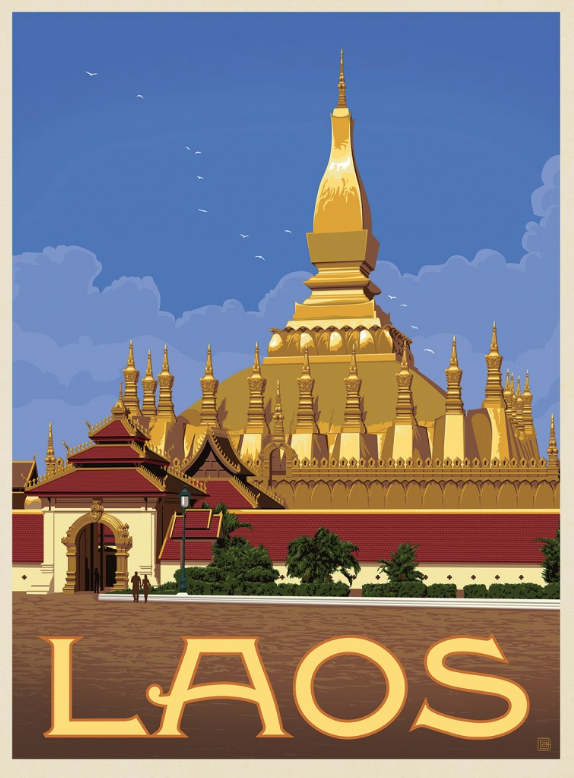
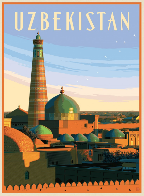
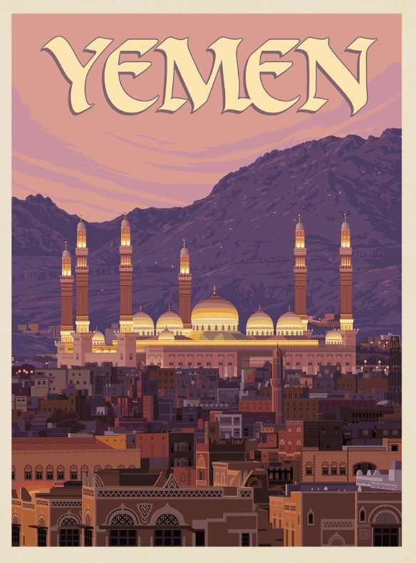
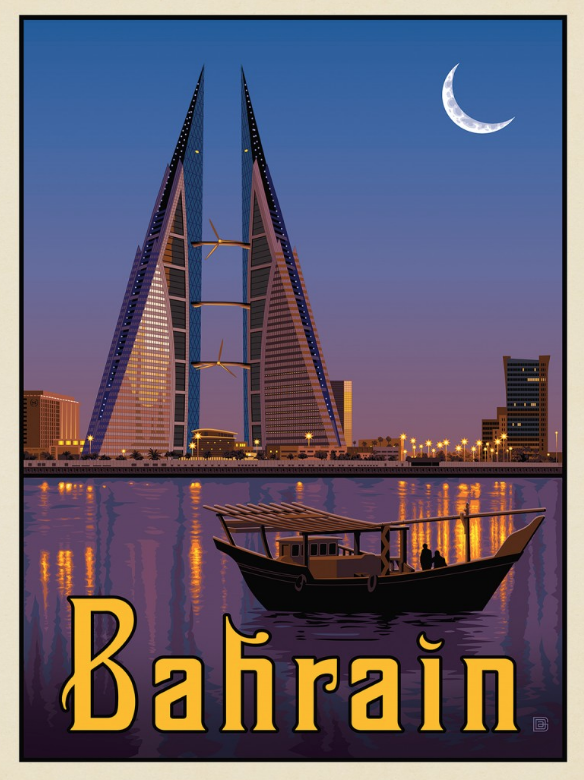
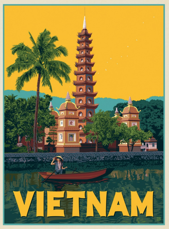
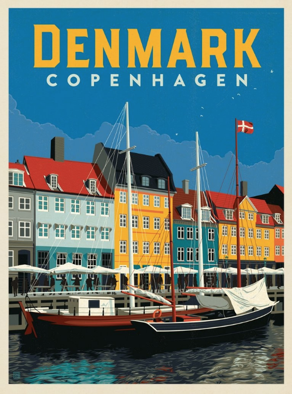
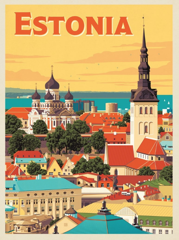
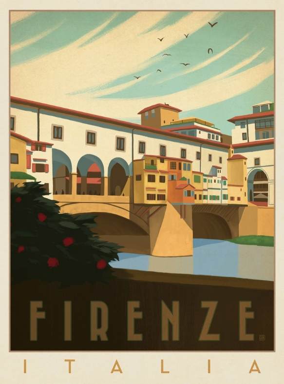
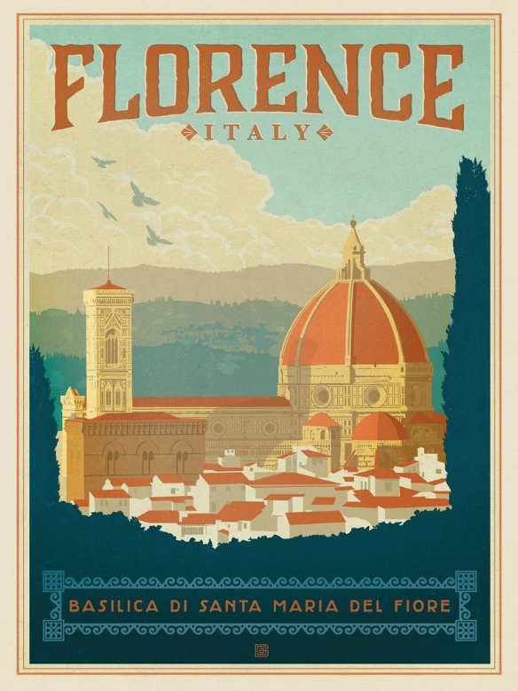
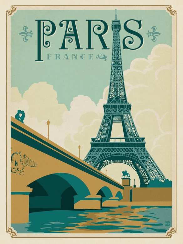
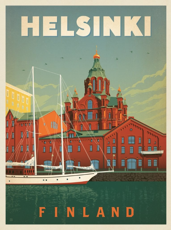
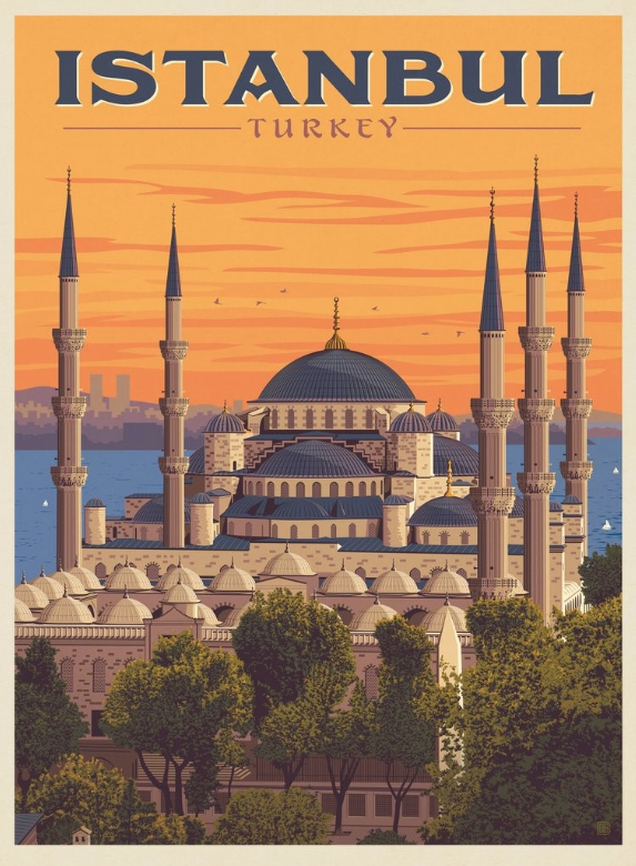
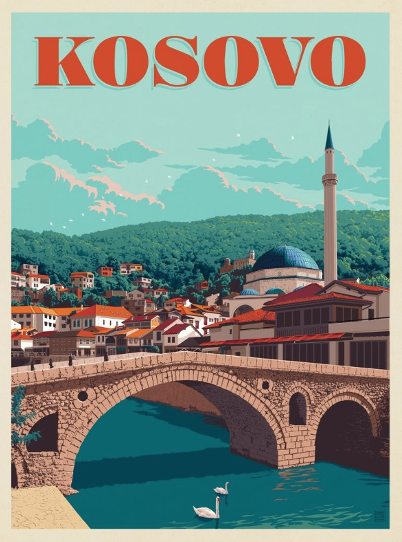
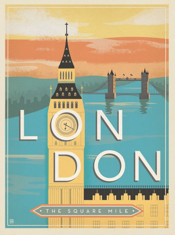
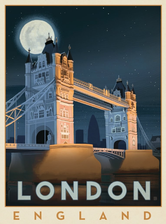
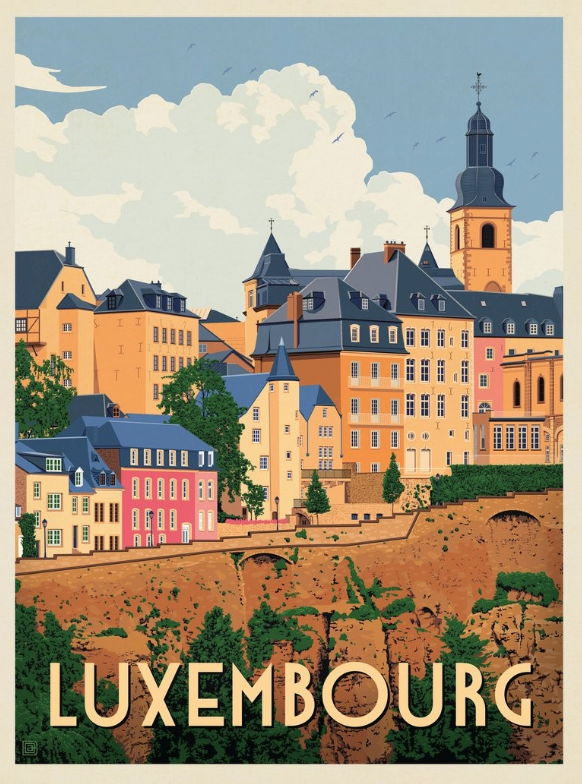
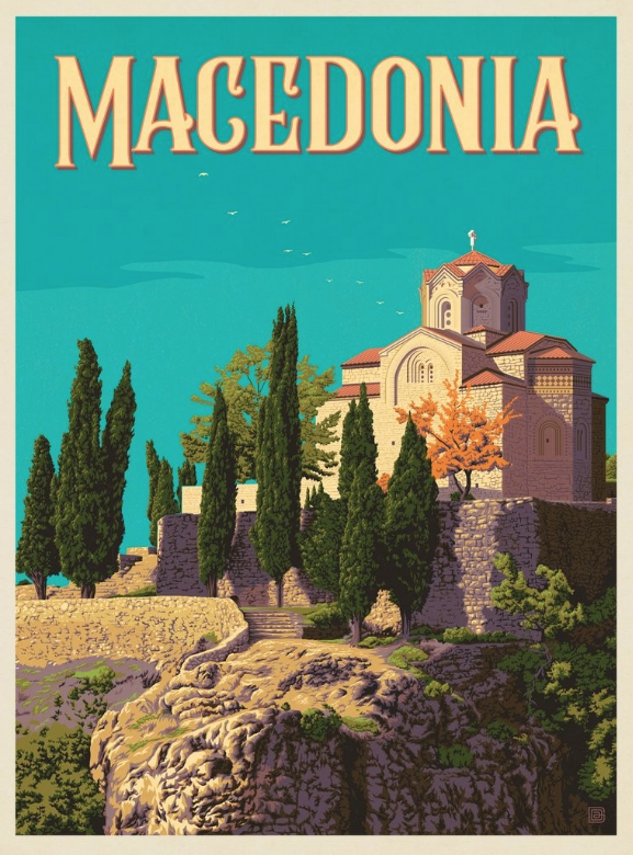
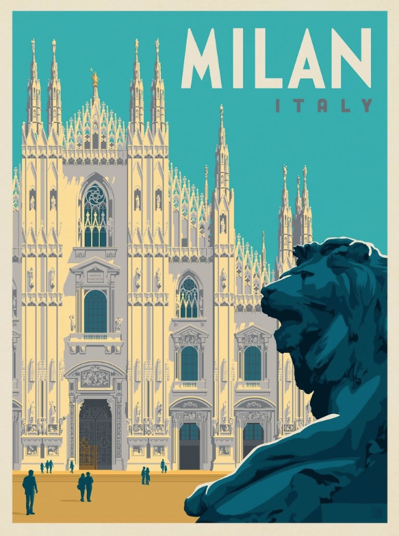
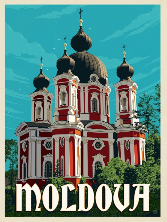
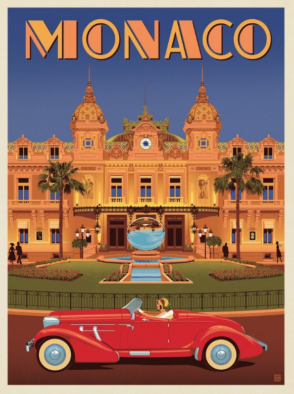
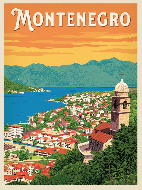
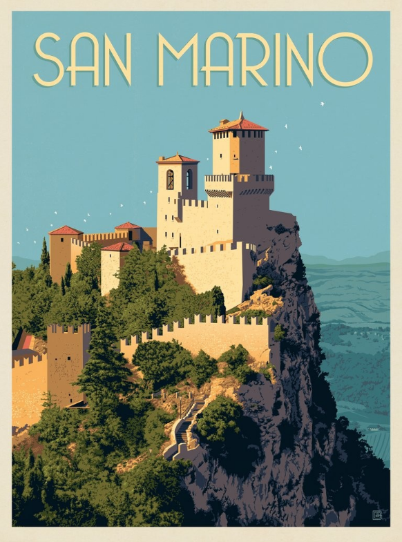
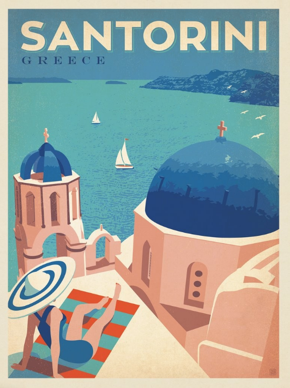
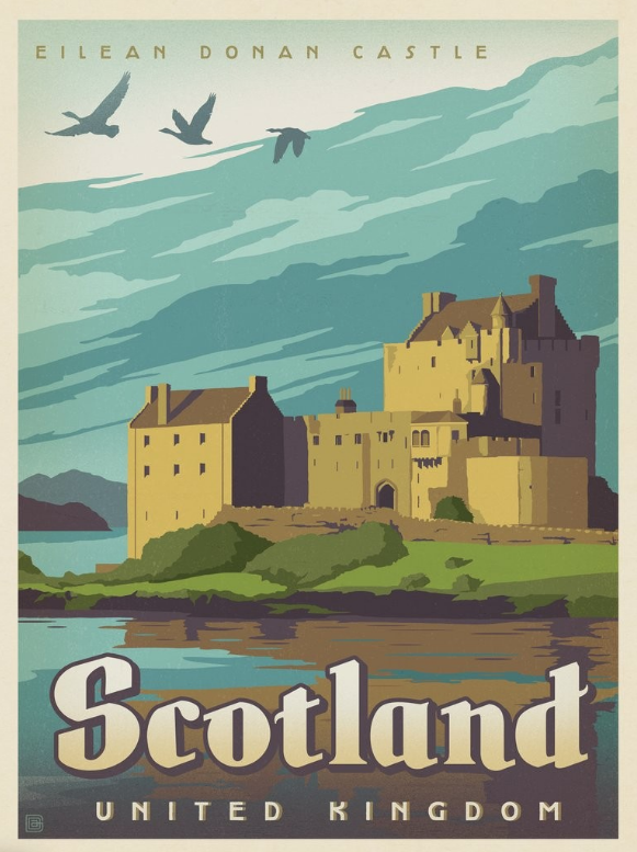
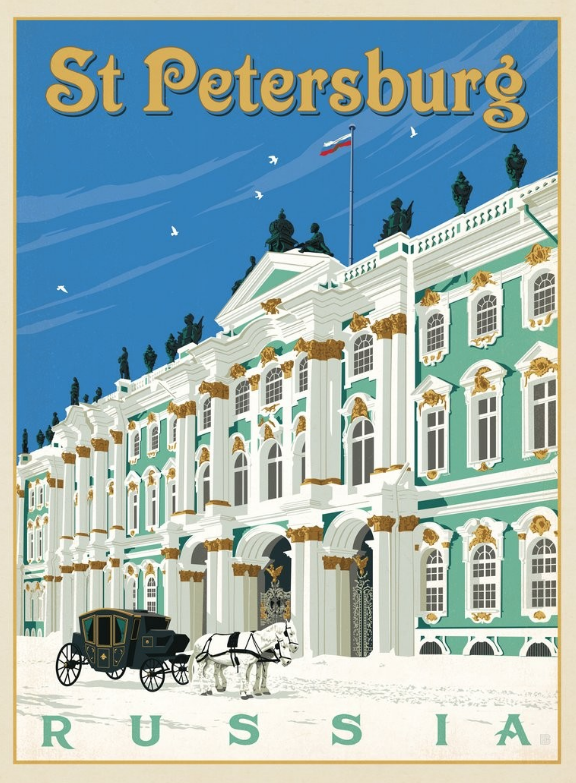
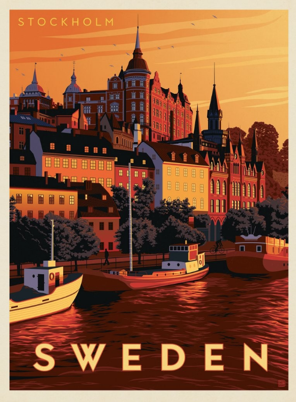
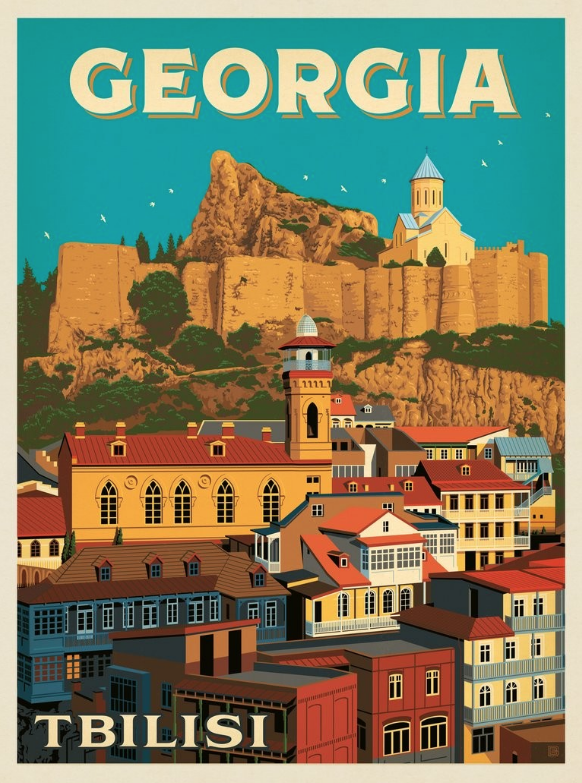
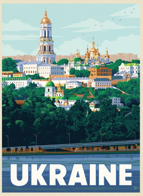
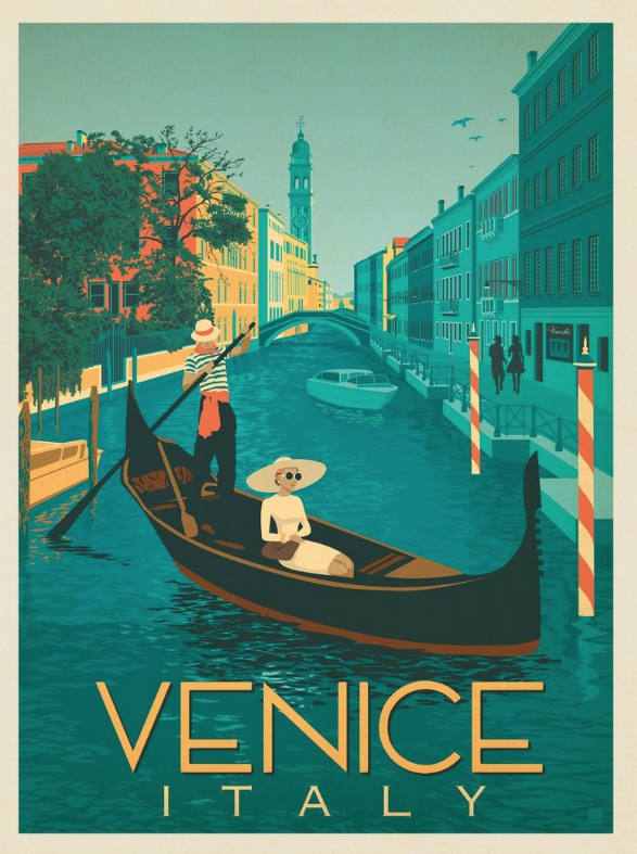
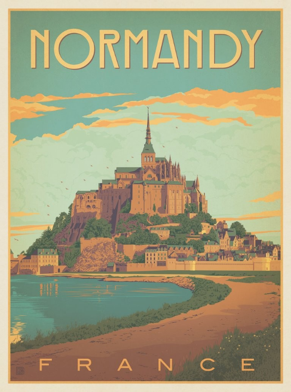
These artists selected notable architecture in order to provide a visual cue that travel can make a difference in our experiences and vistas (views) we encounter.
These artists have excellent control of the elements of perspective, line, contour, form, shading, contrast, color value, and texture. Some also made use of font choices in the shapes of letters and their placement to provide further messages and meanings to the viewer and potential traveler.
What can you learn from them?
Can you appreciate their skills and follow their lead in designing promotional materials for potential viewers or buyers of your architectural model?
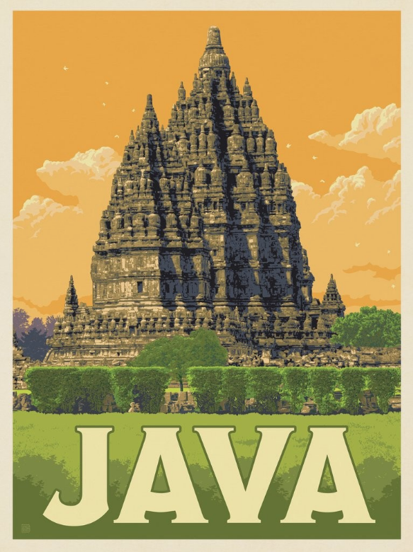
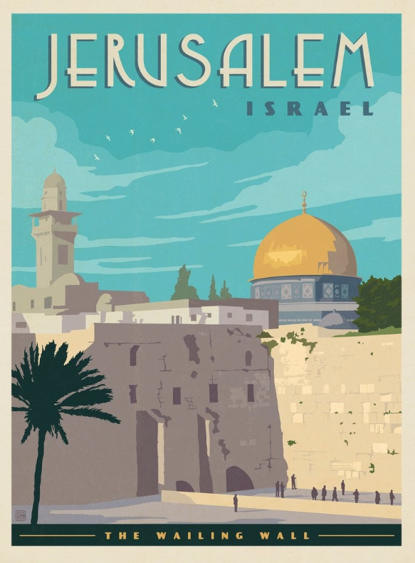
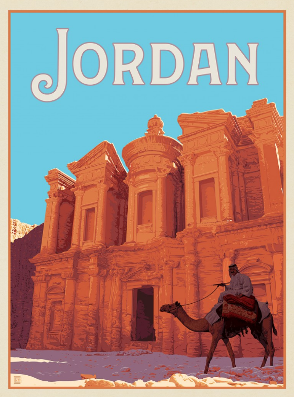
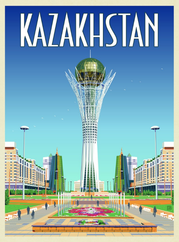
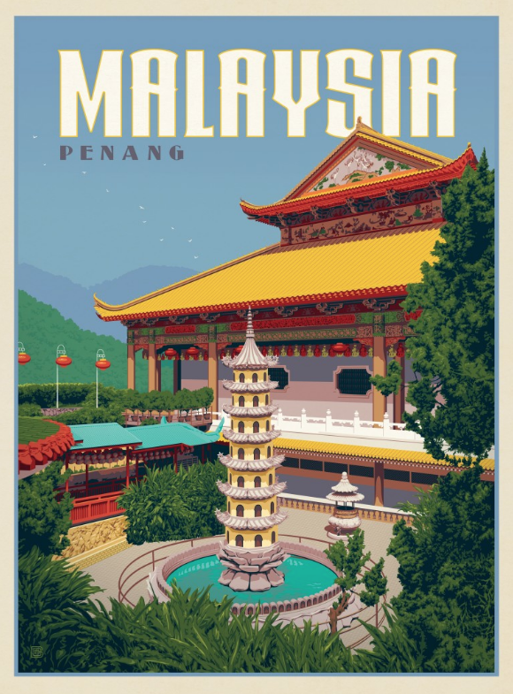
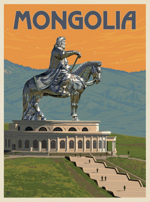
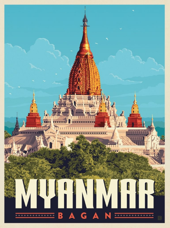
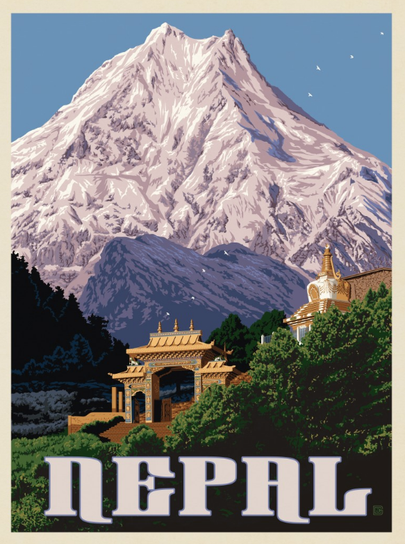
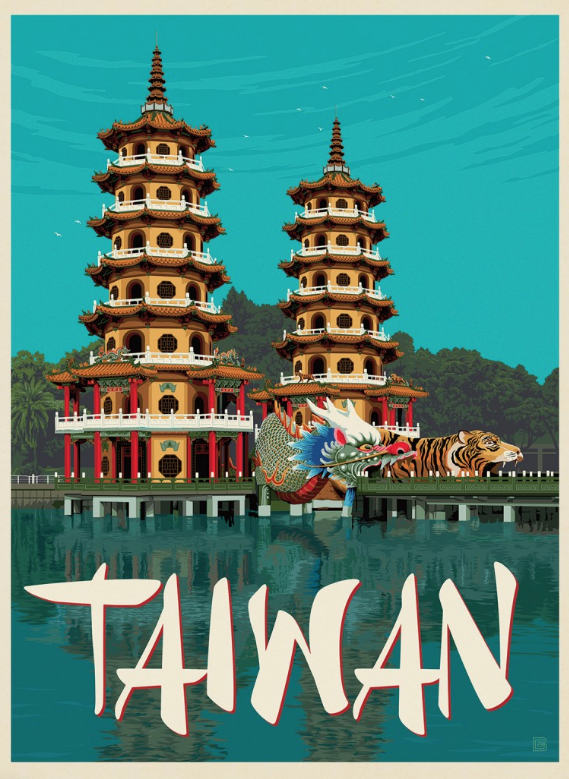
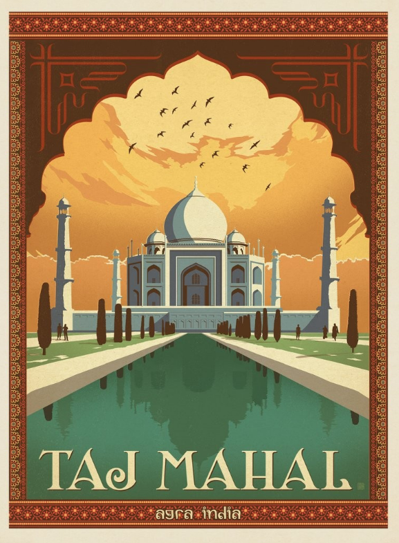
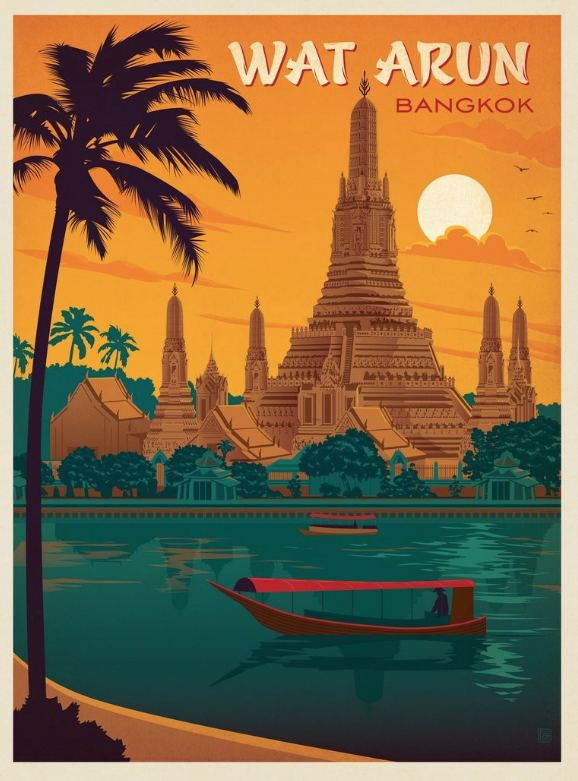
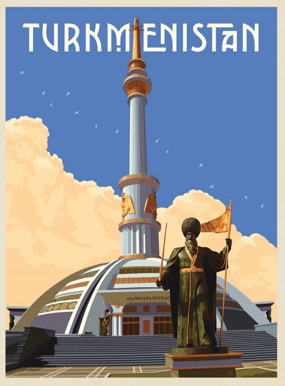
Asia


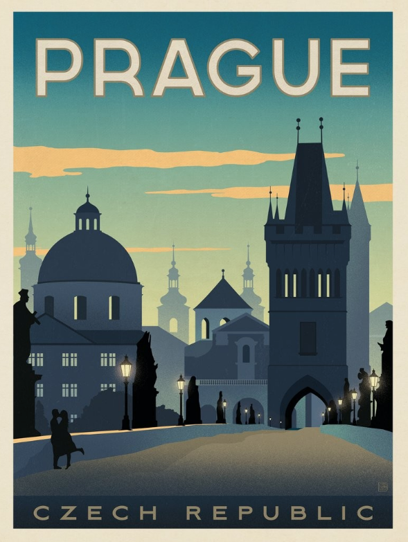
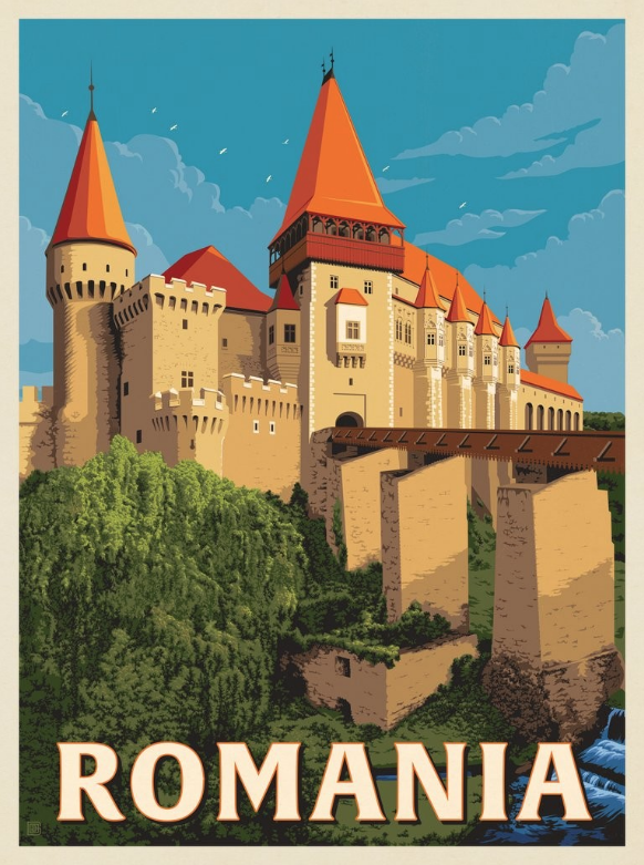
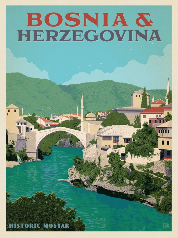
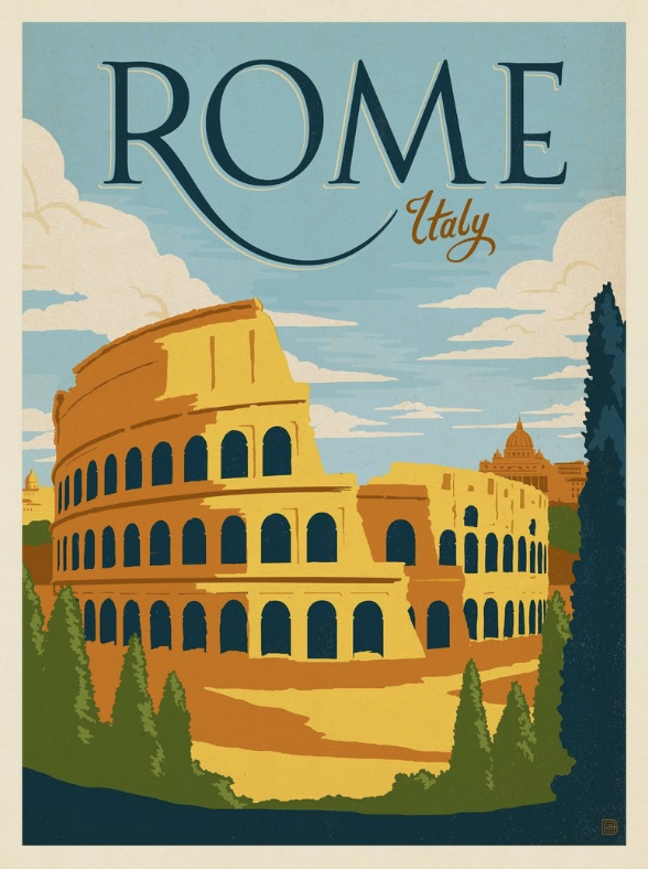
Europe


North America